The purpose of web form validation is to make sure that every user MUST fill the form before submitting, not only that, but also that the values entered are in the correct format as expected to perform a specific task. In this tutorial, we will learn how to create a responsive contact-us form using the BootstrapVue front-end CSS library to validate the form using the Template-Driven approach that VeeValidate Form Validation Framework provides
I am making this tutorial because I found it difficult to use the form validation provided by BootstrapVue using veeValidate. Apparently I discovered that there’s been a lot of changes since that docs was written. I got this idea from a blog post of Positronx and decided to extend it since some codes were already deprecated. Without saying too much, lets gooooooo.
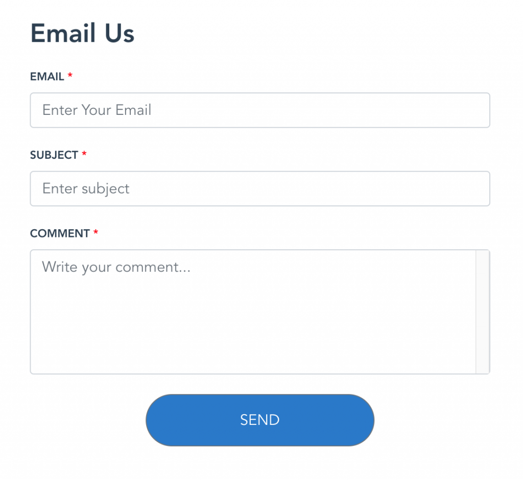
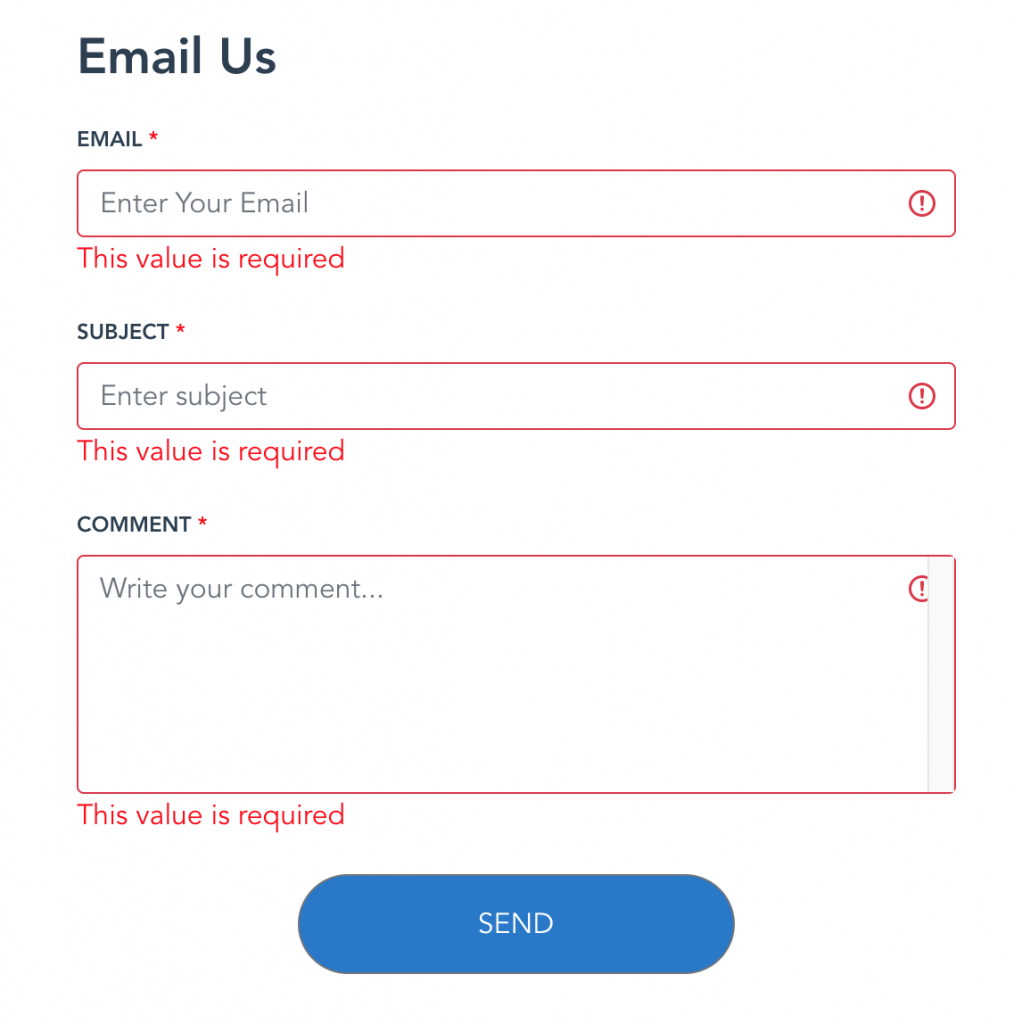
In this contact form, every field will be a required field, also we need to validate the users enter email in the right format (example@domain.com). In this case, three input fields; email, subject and comment
To add the styling, we used a bootstrap-vue package, which is an alternative to Bootstrap 4 for the Vue environment.
Assumptions
- You have a Vue project already scaffolded, if not you need to install and create a Vue project. I won’t walk through that here because that is not the purpose of this post.
- You know how to use Vuejs and BootstrapVue package and if not I’ll show you how quickly
Install BootsrapVue
npm i bootstrap-vueOpen your main.js file and add the reference to BootstrapVue after the import of Vue
import { BootstrapVue } from 'bootstrap-vue'
import 'bootstrap/dist/css/bootstrap.css'
import 'bootstrap-vue/dist/bootstrap-vue.css'

// Make BootstrapVue available throughout your project
Vue.use(BootstrapVue)
Now that you have BootstrapVue installed and ready to use, Let’s design our contact-us form using this framework
<b-form class="mt-5">
              <p class="font-weight-bold h3 mb-3">
                Email Us
              </p>
                <b-form-group id="input-group-1">
                  <label class="font-weight-500" for="input-1">EMAIL <span style="color: red;">*</span></label>
                  <b-form-input id="input-1" v-model="form.email"
                    type="email" placeholder="Enter Your Email"></b-form-input>
                </b-form-group>

                <b-form-group id="input-group-2">
                  <label class="font-weight-500" for="input-2">SUBJECT <span style="color: red;">*</span></label>
                  <b-form-input id="input-2" v-model="form.subject"
                    type="text" placeholder="Enter subject"></b-form-input>
                </b-form-group>

                <b-form-group id="input-group-3">
                  <label class="font-weight-500" for="input-3">COMMENT <span style="color: red;">*</span></label>
                  <b-form-textarea id="textarea" name="comment"
                    v-model="form.comment" placeholder="Write your comment..." rows="5" max-rows="6">
                  </b-form-textarea>
                </b-form-group>

              <div class="text-center ">
                <b-button class="custom-button" pill type="submit">SEND</b-button>
              </div>
            </b-form>

Having done that, validate this form. All we need to do is add some references to the main.js again. This time we need to add the ValidationObserver and ValidationProvider required by vee-validate to make the validation. But before that we need to install our vee-validate package
NPM
npm install vee-validate --save
Yarn
yarn add vee-validate
Now add these lines to the main.js file we talked about earlier
import { ValidationObserver, ValidationProvider, extend } from 'vee-validate';
import * as rules from 'vee-validate/dist/rules';

Vue.prototype.$http = Axios;
// install rules
Object.keys(rules).forEach(rule => {
  extend(rule, rules[rule]);
});

Vue.component('ValidationObserver', ValidationObserver);
Vue.component('ValidationProvider', ValidationProvider);
Next, we should follow the instructions given to us by vee-validate V3 by wrapping our form in a validationProvider so that each input will have one as shown below
 <ValidationProvider rules="required|email" name="Email" v-slot="{ valid, errors }">
   <b-form-group id="input-group-1">
     <label class="font-weight-500" for="input-1">EMAIL <span style="color: red;">*</span></label>
     <b-form-input :state="errors[0] ? false : (valid ? true : null)" id="input-1" v-model="form.email" type="email" placeholder="Enter Your Email"></b-form-input>
           <span class="er">{{ errors[0] }}</span>
  </b-form-group>
 </ValidationProvider>
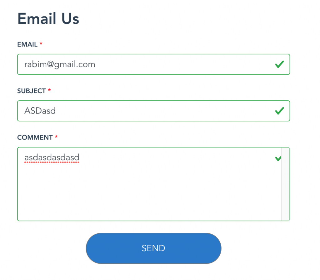
Notice that ValidationProvider has attribute called rules which specifies many things. For example, this ensures that the input for email is required and validated for email format. You can see the rest of the rules from vee-validate. Also notice :state (a prop provided by BootstrapVue ); this is what checks if the state of the input is valid for the entire form to be valid. The corresponding error shows up in the span below with {{ errors[0] }}.
We are almost done.
Vee-validate also states that we wrap the entire form into a ValidationObserver that checks constantly as the user types if the form is valid or not. Eventually, we have this;
<ValidationObserver v-slot="{ handleSubmit }">
            <b-form class="mt-5" @submit.prevent="handleSubmit(onSubmit)">
              <p class="font-weight-bold h3 mb-3">
                Email Us
              </p>
              <ValidationProvider rules="required|email" name="Email" v-slot="{ valid, errors }">
                <b-form-group id="input-group-1">
                  <label class="font-weight-500" for="input-1">EMAIL <span style="color: red;">*</span></label>
                  <b-form-input :state="errors[0] ? false : (valid ? true : null)" id="input-1" v-model="form.email"
                    type="email" placeholder="Enter Your Email"></b-form-input>
                  <span class="er">{{ errors[0] }}</span>
                </b-form-group>
              </ValidationProvider>

              <ValidationProvider rules="required" name="Subject" v-slot="{valid, errors }">
                <b-form-group id="input-group-2">
                  <label class="font-weight-500" for="input-2">SUBJECT <span style="color: red;">*</span></label>
                  <b-form-input :state="errors[0] ? false : (valid ? true : null)" id="input-2" v-model="form.subject"
                    type="text" placeholder="Enter subject"></b-form-input>
                  <span class="er">{{ errors[0] }}</span>
                </b-form-group>
              </ValidationProvider>

              <ValidationProvider rules="required" name="Comment" v-slot="{ valid, errors }">
                <b-form-group id="input-group-3">
                  <label class="font-weight-500" for="input-3">COMMENT <span style="color: red;">*</span></label>
                  <b-form-textarea :state="errors[0] ? false : (valid ? true : null)" id="textarea" name="comment"
                    v-model="form.comment" placeholder="Write your comment..." rows="5" max-rows="6">
                  </b-form-textarea>
                  <span class="er">{{ errors[0] }}</span>
                </b-form-group>
              </ValidationProvider>
              <div class="text-center ">
                <b-button class="custom-button" pill type="submit">SEND</b-button>
              </div>
            </b-form>
          </ValidationObserver>
The handleSubmit will validate the form and when the form is valid, it will fire the function onSubmit() like so. We can also extend the rules to return our custom message – in this case , I decided it will be "This value is required"
<script>
  import { ValidationObserver, ValidationProvider, extend } from 'vee-validate';
  import { required } from 'vee-validate/dist/rules';

  extend('required', {
    ...required,
    message: 'This value is required'
  });
  export default {
    name: "App",
    data() {
      return {
        form: {
          email: '',
          subject: '',
          comment: '',
        },
      }
    },
    components: {
      ValidationObserver,
      ValidationProvider
    },
    methods: {
      onSubmit() {
        alert('form submitted');
      }
    }
  }
</script>


This brings us to the conclusion. Finally, when you hit send and the form is valid you get the alert “Form subbmitted”.
What have we learnt in summary?
We just learned to create Forms in Vue using a css framework BootstrapVue and also looked at how to add validation using vee-validate plugin. It makes validating HTML inputs and Vue components super easy.